Wednesday, 19 April 2017
Tuesday, 18 April 2017
Question 4
Who would be the audience for your media product?
My target audience is 15-25 year olds, mainly females. I want my magazine to still be able to attract males as it would create a wider audience. My magazine will be aimed at females slightly more as there would be parts in there which discuss topics of favourite artists clothing brands and shops they go to and make up. Both males and females enjoy pop music, some may think that males don't like pop as much and may be into rock or rap music more I feel that in recent years there is a wider range of males who do enjoy pop music. By researching other magazines too I have gone for a similar approach as NME and Q.
I believe that my magazine appeals to all aspects of the readers interests and I researched this using my mood board I created shown below.
 The mood board includes pictures of festivals and concerts which my target audience would regularly attend to socialise with other people and also to listen to their favourite artists and bands and enjoy their time. A music TVstation which they would listen to, also a phone and headphones which shows the technophile side of the audience where they are also constantly on their phones. I have also included fashion trends and also artists that my target audience would listen to.
Front cover, Contents Page and Article
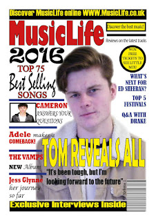
I believe that my magazine reflects my audience as well as their interests. I have included the online website for my magazine so technophiles are able to access it. As technology is becoming more used in day to day lives the magazine industry has to constantly change to keep up to date with their audience's interests. By having an online site it means that magazines often are able to give their audience more content, more pictures and even videos which print obviously cannot show. The clothing in which both Tom and Cameron are wearing on the front cover is stylish which attracts the audience too. Another technique of attracting the audience is the language used like "exclusive" which portrays that the magazine is profession and elite. The content I feel also appeals to my target audience as the top 5 festivals is advertised on the front cover showing inside there will be an article on this and festivals are something that lots of my audience would be attending to have a good time and to experience music with their friends. As Tom is male too it also attracts the female audience, him dressing good and taking some pride in his appearance could generate more sales, and by extension, profit for the brand.
 All the artists I have included in my images are in the target audience age range. They are all also wearing clothing which is fashionable and stylish which would appeal to my audience who are interested in fashion. I think they all represent a true pop artists and bands by what they are wearing and their hair styles.My magazine also promotes social media aspects to the brand which would help promote my magazine even more. This appeals to my target audience as the majority of them are technophiles which means they love being online and using social media. It may also mean they are able to make new friends by discussing their love of music via social media.


My target audience is 15-25 year olds, mainly females. I want my magazine to still be able to attract males as it would create a wider audience. My magazine will be aimed at females slightly more as there would be parts in there which discuss topics of favourite artists clothing brands and shops they go to and make up. Both males and females enjoy pop music, some may think that males don't like pop as much and may be into rock or rap music more I feel that in recent years there is a wider range of males who do enjoy pop music. By researching other magazines too I have gone for a similar approach as NME and Q.
I believe that my magazine appeals to all aspects of the readers interests and I researched this using my mood board I created shown below.

Front cover, Contents Page and Article
I believe that my magazine reflects my audience as well as their interests. I have included the online website for my magazine so technophiles are able to access it. As technology is becoming more used in day to day lives the magazine industry has to constantly change to keep up to date with their audience's interests. By having an online site it means that magazines often are able to give their audience more content, more pictures and even videos which print obviously cannot show. The clothing in which both Tom and Cameron are wearing on the front cover is stylish which attracts the audience too. Another technique of attracting the audience is the language used like "exclusive" which portrays that the magazine is profession and elite. The content I feel also appeals to my target audience as the top 5 festivals is advertised on the front cover showing inside there will be an article on this and festivals are something that lots of my audience would be attending to have a good time and to experience music with their friends. As Tom is male too it also attracts the female audience, him dressing good and taking some pride in his appearance could generate more sales, and by extension, profit for the brand.


My double page spread is aimed to inform people about heart breaking events that happen in life- including pop stars. Showing the audience that they are real people too who have to go through awful events in their life just like the rest of us. This article also shows a way in which you could deal and help yourself when you are in one of these awful situations which is aimed at my target audience as in some ways it gives advice of what you could do.
Tom's costume is simple but stylish and portrays the image of a typical pop star. The photos used also shows a snippit of the personalities a person can have which is also aimed at the younger generation as they are often stereotypically known to have "mood swings." As Tom is also useful too it could mean that people would aspire to be similar to him.
Throughout the whole of my magazine I feel that I have shown my audience clearly and have added things to my magazine to appeal to my target audience of the younger generation successfully within my magazine. Monday, 17 April 2017
Question 2
How does the media product represent a particular social group?

 I liked this layout because I thought that it was much more informative and I thought the page was much more bold and eye-catching. I liked how there were sell lines on either side of the image too, I thought this kind of layout would appeal to my audience as it is eye-catching and informative as one of the main purposes of a magazine is to inform and entertain which is exactly what I intended to do with my magazine.
 I decided I would try and replicate the image of Drake for my magazine with my model for my pop audience. The model in the photograph is a male within my target audience's age range. From my research I found out that my target audience would prefer a single male artist. My artist is wearing a casual t-shirt under a jacket with black skinny jeans and casual shoes, although this outfit is nothing special it relates to the social group of the younger generation and is exactly what is in fashion these days. This image would attract my target audience and social group as although simple, he is dressed stylish and from the research they like a male artist on the front cover. By dressing the artist like the social group it means the audience would have trust in the magazine and it shows understanding of what they like. I decided to use red like Q too as although they are an indie/rock magazine I felt it would work well too with my pop magazine, I added yellow and blue too as I felt it stood out and looked good and are mainstream colours to reflect my main stream audience. The model represents he social group as the facial expressions imitate the "typical teenager" not really smiling, a little moody on times. The seriousness/ moodiness though represents the tough decisions and events that happen during the teenager/ young adult life so I feel that my picture represents the social group quite accurately.
 The images in my contents page reflects the different aspects of pop music, the different artist, duets and bands that are out there. I have decided to keep the same artist for the cover page, contents page and article as it shows how the magazine links together and helps the audience make connection between what they see on the cover page, to the contents page and then to the article. I used numerous artists for my contents page to get a range. I have my main artist at the top of the page and also decided I wanted his article quite early on in the magazine. Next I have a female duo wearing again really the stereotypical teenage/ young adult outfit again simple but it looks stylish representing the social group. My individual artist and the pose shows a different personality, obviously people are all different and poses show a little bit of the characteristics of a person. Then the boy band against a wall dresses in again simple but branded clothing representing the social group. All my artists are within my target audience range again and I feel they all represent this social group rather well. On the page I have also included social media and a website, which reflects the young technophiles I am targeting with this magazine representing the social group as the internet and new technology is part of their day to day lives now. By using male models it would hopefully attract the female audience gaining profit, obviously including females too as the aim of the magazine was to be mainly female but a magazine that males are easily able to read also.
I wanted my product to be aimed a certain social group aim my media product at 15-25 year olds, mainly females which had to be evident in my magazine. When researching magazines to see which kind of magazine I wished to create I decided I wanted to appeal to a pop audience so I had to portray that social group in my magazine. Looking at other magazines gave me inspiration in what images I should include and how to lay the magazine out. I used different aspects of different magazines to create my own front cover.

I came across this image when looking for poses for my artist for the cover page.
I liked this image of Drake because it was simple yet effective. As he is looking into the camera it suggests a good relationship with the audience which I liked. I also thought he looked cool, chilled and relaxed, although you can not see a whole lot of his outfit, it is also plain but appears well dressed which I feel my targeted social group would relate to. For the actual layout of the magazine I was not really fussed on this I felt there wasn't enough information on the page and other than the masthead and the picture nothing really stood out. So I looked at other magazines and came across an edition of Q's which I liked the layout of.
 I liked this layout because I thought that it was much more informative and I thought the page was much more bold and eye-catching. I liked how there were sell lines on either side of the image too, I thought this kind of layout would appeal to my audience as it is eye-catching and informative as one of the main purposes of a magazine is to inform and entertain which is exactly what I intended to do with my magazine.
  I decided I would try and replicate the image of Drake for my magazine with my model for my pop audience. The model in the photograph is a male within my target audience's age range. From my research I found out that my target audience would prefer a single male artist. My artist is wearing a casual t-shirt under a jacket with black skinny jeans and casual shoes, although this outfit is nothing special it relates to the social group of the younger generation and is exactly what is in fashion these days. This image would attract my target audience and social group as although simple, he is dressed stylish and from the research they like a male artist on the front cover. By dressing the artist like the social group it means the audience would have trust in the magazine and it shows understanding of what they like. I decided to use red like Q too as although they are an indie/rock magazine I felt it would work well too with my pop magazine, I added yellow and blue too as I felt it stood out and looked good and are mainstream colours to reflect my main stream audience. The model represents he social group as the facial expressions imitate the "typical teenager" not really smiling, a little moody on times. The seriousness/ moodiness though represents the tough decisions and events that happen during the teenager/ young adult life so I feel that my picture represents the social group quite accurately.
  The images in my contents page reflects the different aspects of pop music, the different artist, duets and bands that are out there. I have decided to keep the same artist for the cover page, contents page and article as it shows how the magazine links together and helps the audience make connection between what they see on the cover page, to the contents page and then to the article. I used numerous artists for my contents page to get a range. I have my main artist at the top of the page and also decided I wanted his article quite early on in the magazine. Next I have a female duo wearing again really the stereotypical teenage/ young adult outfit again simple but it looks stylish representing the social group. My individual artist and the pose shows a different personality, obviously people are all different and poses show a little bit of the characteristics of a person. Then the boy band against a wall dresses in again simple but branded clothing representing the social group. All my artists are within my target audience range again and I feel they all represent this social group rather well. On the page I have also included social media and a website, which reflects the young technophiles I am targeting with this magazine representing the social group as the internet and new technology is part of their day to day lives now. By using male models it would hopefully attract the female audience gaining profit, obviously including females too as the aim of the magazine was to be mainly female but a magazine that males are easily able to read also.

From this article the best representation of the social group would me the images. I chose having three images as it reflects different personalities, everyone has different personalities but it is stereotypical for teens and young adults to flip between them quickly. My article shows a relaxed, joking side, a happy general side and also a more serious side to the artist. All of these reflect with in the article with the topics that have been spoken about like deaths within the family resulting in problems in school and general life and what they did to be the successful artist they are today. The artist is now in different clothes with just a plain branded jumper on, again casual but stylish which would appeal to my target audience.
I have also included the web address at the bottom of the page to promote the online side to show that this magazine is multi- media platform brand. I have also included all the conventional things for a magazine like page numbers, drop caps, pull quote and also the masthead in small font at the bottom of the page to show promotion of the magazine and to remind readers this is the magazine they are reading and to also show professionalism and realism to appeal to my audience.
I have also included the web address at the bottom of the page to promote the online side to show that this magazine is multi- media platform brand. I have also included all the conventional things for a magazine like page numbers, drop caps, pull quote and also the masthead in small font at the bottom of the page to show promotion of the magazine and to remind readers this is the magazine they are reading and to also show professionalism and realism to appeal to my audience.
Overall, I feel like I have represented the social group accurately within my media product as I researched magazines to make sure what I included in my magazine fitted well.
Monday, 20 February 2017
Double Page Spread

Step 1: First I created the graphics on each side of "Exclusive Interview" on the page. I then added the article into the page and then changed the colour of the questions fro black to red to make them stand out on the page and also for the readers to know that it was a question and answer style article. I also added the page number and the magazines website to the page for extra details and also to replicate my plan and a real magazine. I changed the font of my headline to make it stand out on the page more too.
Step 2: Here I added a pull quote to my magazine and I also added my masthead next to the page number so it is throughout the whole of the magazine. I then added the details of words too as one of the final touches to the page. I also added a drop cap to my magazine to make the page itself to look better and more like a real magazine.

Step 3: Here I made the pull quote a lot larger and changed where I placed it on the page. I also changed the colour of it so it would stand out on my page more. I am happy with the layout of my article I feel it looks good on the page and is eye catching.


Step 5 Here I have changed my picture to make my page look more interesting and to show the artists personality more than the previous picture I had on the page. Now I have three personalities on my page. My main image is him being very chilled, then the one subsidiary image is him smiling, and the other is him being serious. This shows the readers some of the personalities he has. I have also now added the same graphics on the top of the page and the "Exclusive Interview" to make the pages symmetrical. I have also changed the title's font to yellow as it stood out more on the page with the picture being behind it.


Final cover: Here I have put a drop shadow on my headline to make it stand out more on the page. I have also made my pull quote a tiny bit bigger so it is more eye catching for the reader.
Friday, 10 February 2017
Music Magazine Cover Progresses
 I began creating my front cover by using the software In Design. I began to create my header and footer bars so that I would have a good idea of the space I have on the page. I also began to create my masthead and also began to create my sell lines. I followed my draft with the colour scheme of red for my masthead with a black outline and I also tried to find a font which was similar. My masthead is bold and stands out on the page. I tried to find fonts that were similar to my plan design.
Here, all my sell lines have been placed but I have not got a picture yet. I wanted to continue on trying to make my progress with the cover page even though I did not have my pictures yet. I have added my pug, my splash and pull quote along with smaller details to make my magazine look more unique. I have also added my sell lines on the right hand side too, I felt that I needed to have sell lines on both side of where the image will go as it gives the page more information.

Here I have changed the colour of my header and footer bar font as I thought that yellow would look better than white, giving my page more colour. I have also changed the colour of the splash as again I thought it would look better and stand out when placed on top of my image. I have made my splash a lot bigger to make sure it fully stands out on the page. I have also changed my pug as the other one had too much black on show, this one I feel looks a lot better as it is not too big yet is still effective and follows my draft design. I have also added my main image, I removed the background using Photoshop and I am happy with how it looks. I think my model suits my pop magazine. I have also added my subsidiary image which I also feel looks good on my page.
Final Cover

Friday, 3 February 2017
Contents Page Progresses
 Step 1: Here I began creating my contents page the first thing I did was to create the black border around my page. I then did the title part of my contents page. I copied my plan design for this but I didn't think that it stood out well enough and was missing something so I placed the "Music Life" and "contents" on a yellow background, I decided I did not like my original yellow contents with a black outline and thought that it should be in black instead which worked really well as I added the yellow background. I think this made it ten times better as all the colours work well together and are eye-catching on this page. I then began just to separate the page up with boxes where I would then add the pictures and the writing. I also began creating the sub heading of "in this issue."
 Step 2: Here I began filling in the contents of my magazine. I inserted blue lines between each page topic as it makes it easier for the reader to read the magazine and it is set out clearly so the reader can direct themselves to which part of the magazine they chose to want to read. I then added the reviews and used the same layout. At the bottom of the page I added the page number which is the same as the numbers of the pages on the pictures. I also added little details at the bottom of the page, including Facebook and twitter and the magazines website to make the magazine more realistic and this also promotes the brand.
Step 3: Here I added the final touch to the page which is the subscription part. I again used a yellow background to make this part of the page stand out. I have decided I will change the pictures too as the contents page needs more of a variety or artists not just artists on their own. But overall I am pl
 eased with how the layout of my contents page looks I think it looks eye catching and very informative.
Final Page (step 4): Here I have changed my pictures to give the contents page more of a variety on the page showing the different artists that will be in my magazine, I now have two individual artists, a duet and a boyband.

Wednesday, 4 January 2017
Music Magazine Plan
Double Page Spread Article Draft
Tom Brookstein,
Moving on to better things!
Tom grew up in
Manchester spending the majority of his time in alley ways and on the
backstreets. It appears that Tom has it all, but in reality it has been a tough
ride for him. Behind the killer voice is a young adult who has struggled
greatly growing up, struggling to cope with his feelings. Today he is here to
discuss the next chapter in his life- his second album ‘Stronger’ after his
first album ‘On My Mind’ was a huge success. The song ‘Happening’ from his
first album was a no.1 single and stayed number 1 for 3 weeks taking Clean
Bandit right off the number one spot. His songs were purely heart wrenching,
filled with emotion. Tom has reached out
to tell us his story about his journey so far, also revealing secrets and
revelations on the way.
Forget what you think
you know about Tom Brookstein and read this interview!
So Tom, your first album has been such a huge success
congrats! Can you tell us what inspired you to write it?[Laughs] Thank you! It has honestly been crazy; I’m so pleased with how it has turned out. I never, in a million years, expected it to be so successful! I’m a bit of a perfectionist when it comes to my songs; I’m so passionate about them. Nothing really inspired to me to write it, at the time when I first began writing songs for this album I was going through a pretty shit time. Writing songs helped me express how I felt, it was my way of coping with what I was going through.
What difficulties were you experiencing?
My father died when I was 15, it was horrific I have never experienced pain like it. I took my pain and grief out on anything and everything. School was a disaster, I didn’t want to be there, I made such crappy choices. I was always in detention or getting suspended for a few days, I was pretty much off the rails. I would skip school, find stashes of booze at home and just drink in an alley way.
I’m so sorry to hear that, what made you decide to write
songs instead of lashing out?
I realised, after about a year that I couldn’t carry on
acting this way. It was actually my music teacher who got through to me, I
think. I can’t thank him enough for supporting me, if it wasn’t for him I don’t
know what state or trouble I would be in today. My mum was obviously trying her
best to help me but she had to worry about my two younger brothers too and she
was also struggling with the grief of Dad.
I would just like to thank my mum for always being there for me, even
when I was being a complete arse. Mr Thomas made me realise that I was doing
wrong. I was not the only one suffering and I be helping my mum and be there
for my younger brothers. He sat down with me and talked to me, he suggested
that I should write songs to try and help how I felt and that’s exactly what I
did. That’s why my first album is called
‘On my mind’; it was about my dad.
Did the album really help with your emotions? The album
is very close to your heart then.Yes, most definitely. Writing the songs with pen and paper most definitely helped and completely clears your mind. All of my anger, frustration, and pain were injected into my songs. When I wrote the songs I was still in a pretty bad place but writing the lyrics down really did help me. I was never good at talking so writing them down and the fact it was so close to my heart really helped: it made my mind a lot clearer.
Were there any artist who influenced the
way you wrote your songs?
Honestly, no. I wrote the songs on purely how I felt. Don’t get me wrong I love Ed Sheeran, Drake, Take That, Busted, Mcfly. I love loads of artists, old ones and also the newer ones but none really influenced the way I wrote my songs.
You’re very passionate about your music. What would you say was your favourite song from your first album?
Extremely! Not to blow my own trumpet or anything because it
was number 1 for 3 weeks, but I’d say the song ‘Happening.’ It was the first
song on the album and not only that it was actually the first song I wrote. I
love all my songs but that one I just feel that although personally it was
about my dad but really listeners could sing it or hear it and it fit something
that has gone on/is going on in their life. The tempo changes which I love, I
can’t quite describe it but it’s definitely my favourite. Honestly, no. I wrote the songs on purely how I felt. Don’t get me wrong I love Ed Sheeran, Drake, Take That, Busted, Mcfly. I love loads of artists, old ones and also the newer ones but none really influenced the way I wrote my songs.
You’re very passionate about your music. What would you say was your favourite song from your first album?
What is your favourite song on your new album? When is it
being released?
Probably ‘Moving on’ I think. It’s quite different, more
upbeat but still has a lot of emotion and meaning behind it. It’s basically
about me moving on with my life, there is a mix between good and bad emotions
it is a good balance. I feel listeners will really enjoy this one as well,
something most people can relate to. You
can really interpret it however you like. I’m really looking forward to
releasing the whole album I am really thrilled. It’s being released June 20th;
I’ll be so nervous the night before! I’m also releasing merchandise not long
after the album is released, it will be released on my website on 10th
August!
It’s been an absolute pleasure having you! Any comments you
would like to say to the readers?
Thank you for having me! Yes, I would just like to thank
everyone for the amount of support that you have given me. It really means the
world to me; if you had told me ten years ago that this is where I would be
right now I would have laughed and thought not in a million years!! I really
appreciate everything so so much.
You can still purchase
Tom’s first album ‘On My Mind’ on iTunes and in music stores. Follow him on
twitter and facebook @TheTomBrookstein to keep up to date with everything that
he’s up to. Visit his website TomBrooksteinMusic.co.uk to find more information
about his merchandise and album.
Photo-shoot PlanShoot Date and Time- 28th January, 1:30 PM
Image Description- Main Image: Medium shot wearing fashionable clothing. Contents Page- Medium long shot of the duet, Long Shot of the 5 boys against a brick wall looking away from the camera. Long shot of individual female artist with a interesting pose. Double Page Spread- Medium shot with different facial expressions
Shoot Location- Against a white wall and a brick wall
Models- Kieran Dobbs, Chloe Neal, Cameron Vaughan, Nia Williams, Megan Taylor, Nathan Williams, Steffan Miles, Nye Phillips, Morgan Stark, Will Robinson
Permission details- They were all wiling to have their pictures taken
Props- No props were required
Subscribe to:
Comments (Atom)